Dark by default
The interface and the brand live on near-black surfaces. Light is information: white text, glowing screens, a tiny blue accent. Nothing decorative disrupts the data-heavy feel.
Gerulata helps you turn complex and noisy online environments into actionable intelligence. This kit is how the brand does the same job visually: one dark surface, light as information, and nothing decorative in the way of the data.
Gerulata Technologies builds AI-powered tools for fighting disinformation and hostile propaganda. The brand borrows its logic from the product: an interface that lives in the dark, where anything that lights up means something.
The interface and the brand live on near-black surfaces. Light is information: white text, glowing screens, a tiny blue accent. Nothing decorative disrupts the data-heavy feel.
Headlines highlight the key phrase in white and mute the rest to 60%. Photography keeps one subject sharp inside blurred motion. Light and sharpness give away the essence.
Hierarchy comes from large size contrast, not from borders, boxes, or color. APK Galeria carries the message; Inter carries the metadata. Everything sits on an 8 px rhythm.
The wordmark is a custom cut built around the double-circle g, a nod to the Roman fort the company is named after. It renders in one color, on one kind of surface: full white on near-black, or full near-black on white.
Keep a margin equal to the height of the g on all sides. Nothing enters it: no copy, no imagery, no edges.
96 px wide on screen, 24 mm in print. Below that, use the g symbol alone.
White #FAFBFE on dark, #08090B on light. Never the accent blue, never a gradient, never an outline.
Only over calm, dark areas of an image; add a scrim if contrast drops below 4.5:1. Never over a subject.
The symbol is the lowercase g, the first letter of the wordmark set free. Two circles stacked on a shared spine, closed by the bar. It is the avatar, the favicon, the watermark, and the loading state.

The g is lifted from the wordmark unchanged: two equal circles on a shared vertical axis, joined by the horizontal bar. Never redraw it; export it from the master.
Use the symbol alone where the name is already established: app icons, avatars, stamps, UI corners. Pair with the wordmark at a 40 px gap in lockups.
Product marks share one grammar: a 440 px grid, a single geometric gesture, one weight of stroke. Each mark is the product’s core motion: GladiOS orbits, Augur scans, Vector converges. The logotype pairs the mark on its app-icon tile with the name in APK Galeria Medium.
Bare marks ship in near-black #08090B for light surfaces; on the dark canvas they invert to white, never the accent blue. Logotypes are fixed lockups: tile, mark, and name never rearrange or restyle.
Two typefaces, strictly divided. APK Galeria, a grotesque with just enough character, carries every headline and eyebrow that speaks with the brand’s voice — eyebrows in Bold, everything else in Regular. Inter carries body copy, UI chrome, labels, and metadata. High contrast in size, minimal contrast in weight. No italics — emphasis comes from color and weight, never slant.
Display: headlines, subheadlines, eyebrows, nav
Regular / Medium / Semi-Bold / Bold
Text: body copy, buttons, forms, labels, annotations
Variable, loaded at 400–600
Long headlines split into a bright phrase and a dim one: the key message in White 100%, the rest in White 60%. One split per headline: if everything is bright, nothing is.
Licensed for Gerulata brand use and not distributed here. Internal teams get the files from the design team.
Open source under the OFL. Download it directly.
Near-black is the ground, white is the figure, and one blue is allowed to glow. Transparency steps of the same white do the work of an entire gray ramp: text, borders, and glass surfaces are all White at different opacities. Click any value to copy it.
Ratios to respect: White 100% on Canvas is 18.5:1; White 60% is 10:1. Live Blue passes on Canvas for large type and UI only; never set body copy in blue.
Inspired by Roman insignias, these supporting elements evoke authority and heritage; every piece is cut from the geometry of the logo. The vocabulary is small: full circle, half circle, quarter circle, and dash. From it come the badges of the five verticals, a full encoded alphabet, and free compositions of three to five segments.
Construction: segments of one ring (radius 16.3, stroke 7.3 on a 40 px tile) arranged on the quadrant grid with hairline seams. Click a letter to download its glyph.
Letters n, i, p, e and r are canonical: they are the shipped badges of the five verticals below. The remaining letters are constructed from the same grammar.
Insignias consist of twelve segments that arrange vertically or horizontally in different orders: full circle, half circle, dash, and nine quarter-circle pairs. An insignia carries three to five segments and appears once per communication material. Switch to letters to set a word in the alphabet instead. Click a segment to change it.
Photography follows the same rule as the headlines: one subject sharp, the rest allowed to blur. Shoot or generate in the dark end of the palette, light the subject with screens or a single source, and let a small amount of blue leak in. No stock smiles, no bright offices, no decoration.
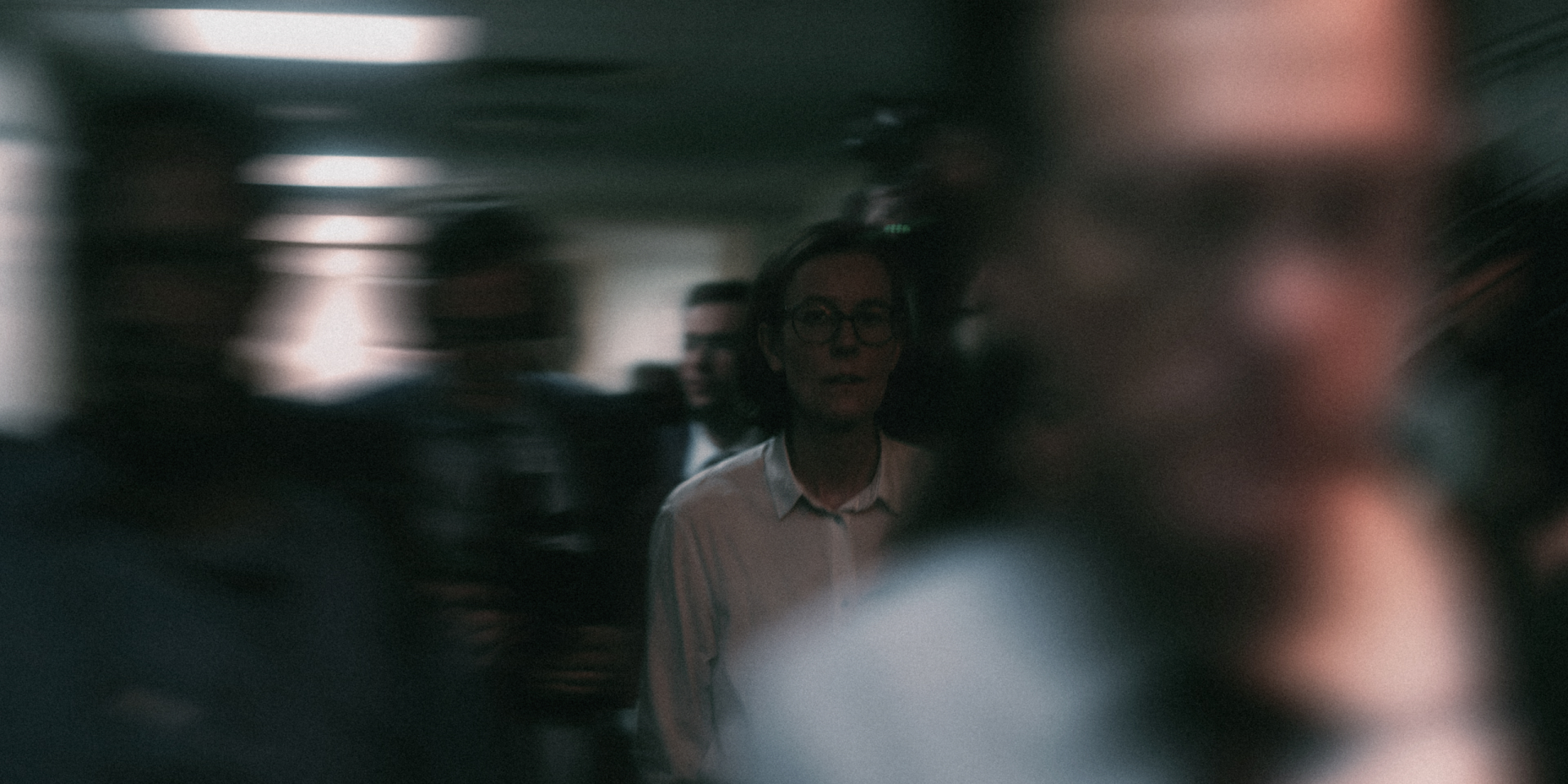
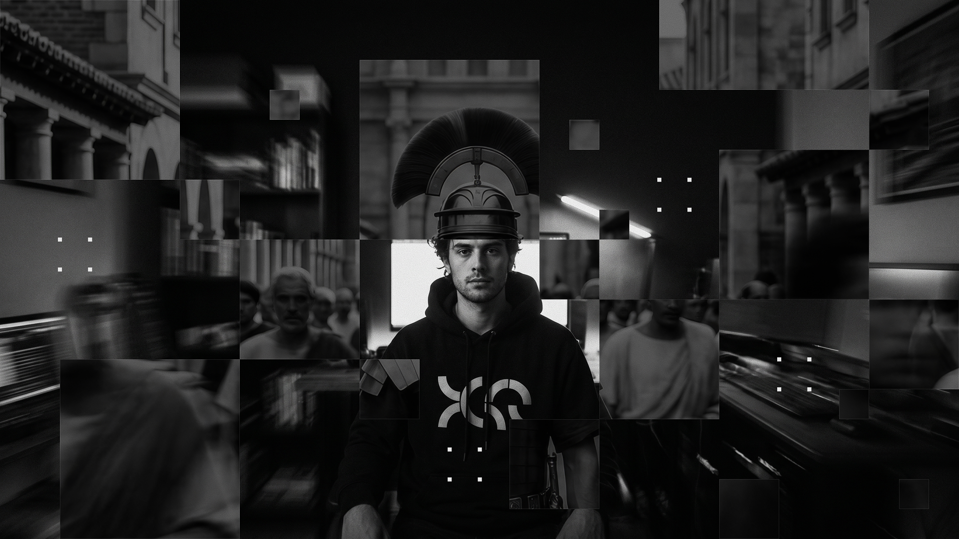

The editorial set: starting points for generated imagery. Keep the constraints (one subject sharp inside blurred motion, near-black ground, light as information) and swap the scene. Click to copy.
Interface elements are glass: white at single-digit opacities, a bevel highlight on the top edge, and motion that settles quickly. The blue dot means live. It is the brand’s smallest and most important element.
9 × 9 px, Live Blue, soft glow. It marks anything happening now, never decoration.
Default easing is ease-out-quart, cubic-bezier(0.25, 1, 0.5, 1). Every animation is gated by prefers-reduced-motion and falls back to its final state.
Every dimension in the system is a multiple of 8, with 4 as the half-step. Off-grid values are not used. The page is a 1600 px canvas with 72 px margins; sections separate with a 1 px hairline at White 20%, never a color change.